Chicago Zine Fest 2014 Post-Mortem!
Posted: March 18, 2014 Filed under: Conventions, My Favorite Things, Simon | Tags: Beth Hetland, chicago zinefest, doom metal, Gina Wynbrandt, henry comerford, jason walz, kuwai shen, speculative relationships, stranger two stranger, Upgrade Soul, zine fest Leave a commentDude… Chicago Zine Fest was awesome!
Thank you to everyone that stopped by! Here is my table:
 I was lucky to have awesome tablemates in Violet & Jay. They did zines and comics about METAL. So we got along great. They were even keeping the mix tape alive:

That’s right… that’s a CASSETTE MIX TAPE! Flipping awesome. This one was a mix of doom metal, which happens to be my music obsession at the moment.
As usual, there were tons of great artists exhibiting. Here is my bounty from a day of tabling and meeting artists:

There is some really good stuff in there:
– Stranger to Stranger and Depictions from the always kind R. Hendricks
– Beth Hetland’s Fugue series COLLECTED. Man I can’t wait to re-read that series in one book!
– Kuwai Shen’s Suburban Mystic had gorgeous drawings accompanied by intense and soulful prose.
– Jason Walz’s Homesick is an masterful meditation on loss in life.
– Someone Please Have Sex With Me is the newest in black comedy from one of my favorite’s, Gyna Wynbrandt
– The green pumpkin-y one there is a filled with delicate ink drawings by Nick Straight
– I traded Mr. Steve Keiser for his mini comic You text your mama with that font?
– Another trade acquisition was Drew Damron’s Comics for Something
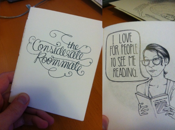
Not a bad haul. To be honest though, I was most excited to get 3 new comics from the amazing young comicker, Henry Comerford. Henry can’t be more than 6 years old, but I’ve seen him at the last two Zinefests and traded with him. His work continues to get better every year. This year, one of his newest comics was a profound meta-comic. It’s simply called ‘The Comic’:
 In The Comic, Henry shows a sequence of inanimate objects making statements of what they can do in a comic. A crab saying how this comic is “where crabs have two legs” or an egg salad with a gun saying that “egg salad is evil”. Even The Comic makes an appearance IN the comic:
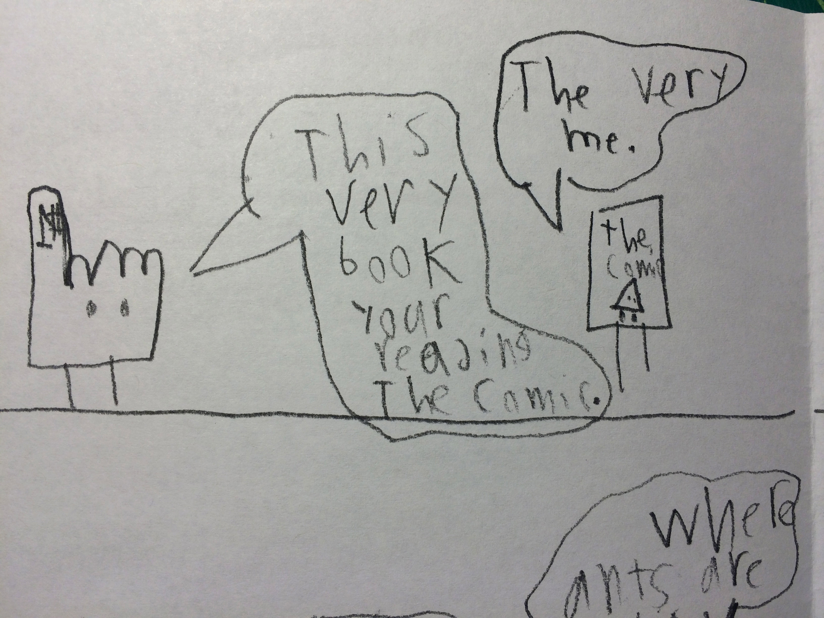 It’s pretty much the most amazing comic I’ve read in years. It ends with this perfect image on the back cover:
 Inspiring stuff. Can’t wait to see what Henry cooks up next.
Thanks to everyone who stopped by and said hi! Special shout out to those who recognized me from Brain Frame, even sans beard!
…
I’ve been VERY busy. Here are some sneaky peeks into what I’ve been working on…
Here is the cover of the next Chapter of UPGRADE SOUL, which will feature my INKING!

It comes out later this month, so go get caught up on the story NOW: Upgrade Soul for iPad
…
And here is the Simon piece I recently had featured in the Chicago Reader Comics Issue:

And…
 …
…
That’s all I have time for at the moment. Thanks!
– Tyrell
Brain Frame Process
Posted: March 2, 2014 Filed under: Process, Simon | Tags: Brain Frame, comic performance, ghost fleet, independent comics, katsuhiro otomo, kickstarter, otomo, performance art, simon, simon comics, tool, Upgrade Soul, Upstream Color, zao 2 CommentsOh man… it’s been a while. I’m sorry ya’ll. I promise it’s cuz things have been crazy busy in the best ways possible. I’m excited to tell you more, but still have to keep some of it secret. But teasing…
– Convention Schedule
– Inking one of my favorite sci-fi comics?
– Interviews?!
– Art show???
– Pin-up for (insert secret publisher name)?!
– A Kickstarter?!?!
More info on the way for all that. But for now, I wanted to give you a peek behind the curtain on my recent Brain Frame Performance. Onward!
…
BRAIN FRAME PROCESS
So, last month I had the honor of performing at Chicago’s famous comics-performance-experiment-wacky-fun-amazing Brain Frame series. When I was asked by organizer, Lyra Hill, I was equally excited and terrified. I felt pressure to do a good job, since the show has such a rich history of awesome performers. I also wanted to try something new for me and different from other performances I’d seen. I came up with some criteria that I wanted my piece to meet:
– No video projection (I’m actually sick of video projection in all art right now)
– Must have music
– No talking
– Must have live drawing
– Must have audience interaction
Lyra had specifically requested that I do a reading featuring my experimental style work, which usually means Simon. He’s my default for experiments in comics, so I was happy to oblige.
My initial thought was to do a whole piece that was live drawing. I pretty quickly realized that would be a limiting in both scale and detail. I wanted the piece to have the impact that comes from large scale drawings. So I figured I’d have pre-drawn images and focus on how drawings can change via additions, subtractions and paper folding.
So, the piece bounced around in my head for a month or two (Lyra graciously gave me tons of time to create my piece) and I’d do sketches or fold paper in random ways to see how it looked. Finally I started sketching the actual piece on paper and figuring out the sequencing. As for theme… It sort of comes to me AS I’m drawing with Simon. I’ll have a thought, then I develop that as I sketch. It’s kinda like having a conversation with someone to solve a problem or come to an understanding. But I’m having that conversation between my brain and hand and paper. As this Simon comics developed, it became about what it means to feel, think, reflect, and share with the world. Basically, it’s a piece about what art is to me.

The sketching process was a great way to start figuring out which sections would be folded paper, live drawings, or ‘paste downs’ (though no paste would be involved). As I figured out Simon’s progression through the piece, more and more challenges became apparent. The hard part became what would I cut or alter from the piece to make it manageable on the large scale I had planned. Lyra had also thrown a curveball in about halfway through the planning process: there would be two performances on the same night! This was exciting news, but also meant if the performance would have to work two times, meaning I’d have to not damage it and couldn’t do live drawings over pre-drawn images unless I wanted to draw them twice. Honestly, I like having challenges, so this was… good news?
SCALE
I wanted this to be big enough that people in the back of the venue could still see it, but not so big that I needed an assistant. The size I landed on was 4 1/2 feet wide by 4 feet tall. This was still… really big. Moving this beast around is not easy.

It’s still sitting in my living room because I don’t know where to put it. Once I knew the size, I could buy paper and start drawing the ‘finished drawings’. Which I knew would take a while. So before I started, I wanted to get my music sorted out.
MUSIC
Initially I thought I could just piece together something on my own from tracks I liked. I also have a small synth and thought that might work. I quickly saw that this was A. too much work, B. would take time away from drawing, and C. would make it hard to adjust during the performance if something went wrong. Plus I was interested to hear what a musician would bring to my images. Luckily I work with the extremely talented guitarist Chad Nannenga. Chad has played with some awesome bands like the Fabulous Naturals & Merle the Mule. I gave Chad all the sketches in a powerpoint presentation so he could see the flow that would eventually happen from image to image. We talked a bit and I gave ideas about what mood I wanted each section to have. This was very broad (“this part should be exploratory, this part should be sad”). I also provided some tracks that I wanted him to reference or try and emulate (but not copy). Things like :
Then he just ran with it. We met a few weeks later and he had a string of riffs for me to hear. I gave him feedback on what I liked and didn’t so he could make adjustments. Shortly after that we met with drawings and guitar in hand and started to really knock out which riffs fit which drawings. Then figure out how to accent each section with effects pedals and how to transition from one major section to another. We came up with cute nicknames for the riffs, so we could tell them apart. Things like ‘chickin pickin’ and ‘radiohead riff’. After that it was just up to me to finish drawing all the dang pages, while Chad practiced the music and transitions.


For those curious about Chad’s gear, he was playing a Fender Jazzmaster guitar. He used a Line 6 DL4 for looping and another delay pedal for the textures. All this was fed into a classic Vox Pathfinder amp.
DRAWING
Since the drawings were so large, I used large 70#-90# paper, purchased on rolls. Since it was rolled, I had to flatten each section after I cut it. So often-times my dining room was occupied by big sheets of paper on the floor covered in heavy books. Actually, as an artist you find sections of your house taken over by projects often. You get used to it, I guess.

I used a video projector (yeah yeah, I know I said I wasn’t gonna use one, but I meant in the performance) to up-scale my rough sketches and keep proportions. Then I put the drawings on the floor and fleshed them out more. I was drawing with Sakura Permopaque black markers for my black lines. Originally, I was going to use Fatty Sharpies. But there are a lot of parts where pages have to fold, and the Sharpies were bleeding through. I actually tried a ton of different markers and paper stocks, but Sakura was the only brand that didn’t bleed through. I did have to use a different marker type for color, as I could only find black and white Sakuras. I ended up using the Blick brand art markers. Which… absolutely suck. I could barely get one page colored before they ran out. I ended up buying like 15, as I was afraid changing brands would produce a noticeable change in the color. And of course, they bled through. So on pages with images on the back of the paper, I had to paint white over the bleed through. It was kind of a pain. Next time I’d probably try a thicker paper ($$$) or use pastels (though that would be messy).
Once most of the drawings were complete, Chad and I began practicing with the large drawings and music together. This is where all the kinks were worked out. Things like how I’d attach the paste downs (ended up using good ol’ “tack stuff”) and how Chad would transition his effects from section to section.

I think in total we did about 4 run-throughs, including one on the morning of the show.
PERFORMANCE
The Brain Frame Crew of Brad, Emma, and Lyra were extremely helpful and positive during the whole set-up process. We were at Constellation, which is a very cool venue. Intimate, but not small.

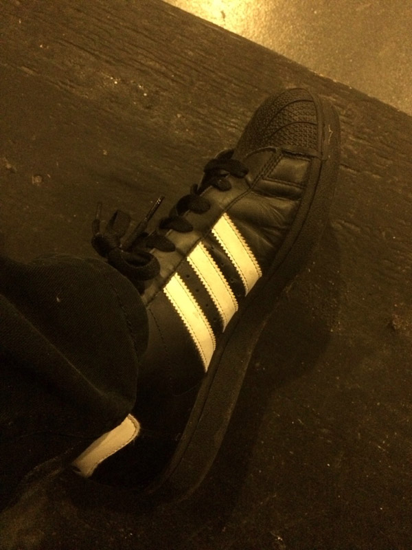
Chad and I chose to appear in all black, to let the Piece be the focus of the show, rather than our kooky outfits. I, of course, had to wear my Adidas shell toes, as that is where my magical powers come from.
The performance climax is me reaching inside the final drawing, and pulling out small paper cubes to throw into the audience. This was challenging to find a solution for. I didn’t want to use objects that were too solid or heavy, as they could potentially hurt someone. But if they were too insubstantial, they wouldn’t be ‘throw-able’ and it would just look sad when I tried to pitch them out there. I decided to try paper cubes, as they are cheap (I had already spent a lot of money on this) and they mimicked the paper being used in the rest of the performance. The problem with these was, of course, they are too light and would fly far. I tried different paper stocks, but nothing really worked.
Then my beautiful, amazing, intelligent girlfriend came up with a solution. She is a jeweler and she had a bag of metal shot (tiny metal balls). She suggested putting one or two inside the cubes. We tried this out to ensure they’d fly far enough and not hurt anyone. I actually threw cubes at her face and she told me if it hurt or not. Yes, that is how I said thank you. We filled about half the cubes with metal and left some unfilled so they would ‘float’ more and stay in the front row.
After the second performance, Lyra actually ATE one of the cubes as we cleared the stage. This was awesome, but had me worried she had eaten metal. Luckily, she had not eaten a metal filled cube. She assured me after a few days that “everything came out ok”.

DOCUMENTATION
Documenting your work is incredibly important. I work at an art school and that’s the main thing I try to make clear to every student I talk to. If you don’t document your work, it didn’t happen and doesn’t exist. Luckily, Brain Frame has an awesome photographer and videographers. That’s where I got most of the images in here, as well as one of the videos below. So, take a look at my performance! It’s 16-ish minutes, but please watch till the end for the exciting conclusion.
Photos…


Thanks to Gillian Fry for the awesome photos.
Videos…
This video was of the 1st performance and shot by Kyle O’Connell
This is the official Brain Frame video of the 2nd performance. Thanks to Jack Wensel, Cooper Collier, Cody Wallace, & Tyson Torstensen.
…
Hope you found my rant about creating this piece interesting. It was a lot of work, but a lot of fun. Transporting and storing this giant project was also a huge challenge, but that’s probably less interesting. So I’ll end it here for now. I’ll leave you with some images of other stuff I’ve been working on lately:


 I’m kinda obsessed with the new Prophet series by Brandon Graham & crew. Working on it would be a dream. For now I guess I’ll settle for doing fan art.
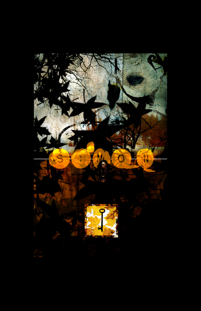
 Here’s a new Simon Piece I am excited to start on… even though I can’t dive in yet. Based on a song by the great Pallbearer.
…
Piece to you!
– Tyrell
Victus #2 Available for Pre-order
Posted: December 16, 2013 Filed under: Buy Stuff!, News, Simon, Victus | Tags: independent comics, independent sci-fi comics, simon comics, victus Leave a commentHey hey, the day has finally come… Victus #2 is ready for public consumption! I’m really stoked about this second issue and I hope you are too. As with last time, I have some special bonus’s so read on…
The Story Continues:
Isaac continues gathering artifacts for Absalom, while also working with Alphonse and Dom to mark the city. A local religious group worships together at a cathedral under watchful eyes. Children are frightened by a strange creature seen near Absalom’s shop. Isaac witnesses a shocking event while spying on Absalom.
Product Images:


More product images HERE
I also have a 5 page preview of the story HERE
Pre-Order BONUS:
All orders placed by 12/20/13 will receive a free 8.5″ x 11″ print:

DOUBLE BONUS:
As before, the first 10 pre-orders will receive pages ripped straight from my Victus sketchbooks…


 …
…
So, what are you waiting for?
…
SIMON: PUGILIST
And while you’re over at the store, you can also order the newest Simon mini comic:


…
This is the second collaboration between my brother Logan and I. The initial print-run is EXTREMELY limited, so go get yours now:
…
Thanks for all your patience as I worked to complete the second issue of Victus. I am very proud of the work and I think you’ll find it to be worth the wait. More news to come next week!
– Tyrell
8 Things & New Things
Posted: October 9, 2013 Filed under: Back Issues Podcast, My Favorite Things, Simon, Victus | Tags: 8 things, Beth Hetland, Brandon Graham, Gina Wynbrandt, katsuhiro otomo, Kenan Rubenstein, Reid Psaltis, Rinko Endo, simon comics, The Maxx, Upgrade Soul, victus 2 CommentsBeen a while. Sorry about that, but I assure you I’ve been busy. So let’s get to it!
…
8 THINGS I’D LIKE TO SEE MORE OF IN COMICS
I became aware of this topic via a tweet by Brandon “I will use my comics powers for good” Graham, then followed up on a couple other bloggers thoughts on it…
Here:
Here:
and Here:
Comic Book Resource’s Jesse Hamm
And immediately I was thinking about how I always complain about comics, but rarely do I say what we really need more of to improve the medium as a whole. All of the above gents make great points, so I’ll try not to just list the exact same things as them (though some of mine are similar). In no particular order:
1. Stylistic Diversity in Artwork

I’d like to see more artists who don’t just ‘look like (name other artist)’. Mainstream comics are like that movie Wrong Turn. They have been inbreeding so long that you end up with deformed characters drawn by artists with no sense of real anatomy and proportion. It’s like an exaggeration of an exaggeration. I don’t want to see a comic and immediately think of another comic book artist. Artists should strive not only to stand out from each other, but to make each work feel unique from the previous one.
Positive Example: Katsuhiro Otomo. We all know him for Akira, but the dude’s short stories span all genre’s and styles.
2. Influences from mediums outside of comics

We need to reach outside of the medium for influence, reference, and inspiration. If you are working on a new project and the only thing you are looking at is other comics, you are failing. We have 100’s of years of art, music, and literature to look back on, so why is it that every sci-fi comic looks like Blade Runner and every Superhero comic looks like Superman? I want to see comics influenced by Davinci! By the Venus of Willendorf or the Lascaux cave paintings! By Brahm’s Requiem and Jackson Pollock!
Positive Example: Reid Psaltis takes a very direct influence like natural history illustration and runs with it!
3. Hand Lettering

The lettering of a comic is not something that should feel pre-packaged. It’s another aspect that gives a creator a chance to literally make their mark. Hand lettered speech, thoughts, and sound effects should feel unique to the story being told and unique to that specific artist. We use hand-writing to identify people in court cases, for crying out loud! What’s more YOU than your handwriting?
Positive Example: Sam Alden (see above) uses a variety of fonts, balloons and sound effects which are tailored to each story.
4. Diversity of genres

Comics should not be a section of the book store next to Romance, History, Philosophy. Romance, History, Philosophy should be sections IN THE COMIC BOOK STORE! We all want to be taken seriously, but the extremely narrow amount of genres and topics covered in mainstream (and indie) comics is absurd. When’s the last time you read a comic about philosophy? Or religion? Or Australian Aborigine tribes? Or history that didn’t involve zombies? AND WHY ARE THERE NO ROMANCE COMICS ANYMORE?
Positive Examples: Rinko Endo makes comics about mental health issues (pictured above). They are absolutely stunning.
5. Odd shaped and non-traditional comics

Comics don’t have to be ‘standard’ sized. Especially independent comics! Why are most comics the same size as the latest issue of X-men? Why are most comics rectangles and squares? Why don’t comics fold out in multiple directions? Why are they all on paper? If a standard size comic can be read on an ipad, why should I buy the physical copy? Comics should be unique objects whenever possible, to give the potential reader a reason to buy a physical object that will take up space in their home.
Positive Examples: Beth Hetland’s ‘Hay!’ comics are unique objects AND choose your own adventure comics
6. Special Features

I love to see the process behind any piece of art. It’s interesting and gives insight into the artist’s thought process. Seeing how others make or struggle to make their work inspires me to continue on in my struggle as a creator. I’m not just talking about some sketches in the back of a trade paperback (though that’s a start). I’m talking blogs that explain how my favorite book of the year was lettered. I’m talking audio commentaries for the comic that can be downloaded and listened to while you read it. I’m talking video time-lapses of the pages being created. There are some folks that do give peeks into their process, but it’s rarely project specific and isn’t usually tied to the release or post-release of the work.
Positive Example: Kenan Rubenstein has a SLICK interface for his webcomic Last Train to Old Town, which shares insight into each pages creation and allows for readers to interact.
7. Digital Comics that take advantage of being digital
Most ‘motion comics’ are absolutely terrible. Just the worst thing that could possibly be done to a comic book. I want to see artists that choose to work in the digital medium take full advantage of it. The tablet devices are full of functionality and features. I want the digital comics to show me that they can ONLY exist digitally. Colors that change in panel. Word balloons that pop in or out depending on where you tap. Sound! And I don’t mean cheesy sound effects, I mean ambience and music.
Positive Example/s: Kenan (mentioned above) and the now-extinct Double Feature from Four Star Studios are both good examples. But my favorite digital comic is hands down Ezra Clayton Daniel’s Upgrade Soul (see above). It’s a tour-de-force in digital comics!
8. Cross-promotion between creators

Comics should feel like a community. Just like anything else we buy, you’re more likely to pick something up if it’s recommended to you by someone you trust or respect. All the advertising in the world won’t help niche weirdo comics (like everything I’m asking for above) get into a reader’s hands. But if they are at a convention, speaking with a creator, and that person is aware of the rest of the community, they can point the potential reader in the right direction. People buying ANY COMICS is good for everyone MAKING comics. So what if they don’t want to buy my book about a serial killer? They might be really interested in Gina Wynbrandt’s Tiger Beat Exclusive. So SEND EM OVER TO HER! We need to promote eachother, not just ourselves.
Positive Example: Brandon Graham is constantly pimping cool creators on his blog and in backup stories in Prophet. Can you imagine if all high-profile creators were taking time to show us the new people whose work they love?
That’s my thoughts on what we need more of. What do YOU think?
…
NEW BACK ISSUES PODCAST

Justin and I sat down to analyze Sam Keith’s The Maxx on the latest Back Issues. This dude was on the edge at Image, with a bizarre book that took on rape, dreams, and comics industry tropes. Oh… and there was the Crappon. We loved it. Please listen:
…
VICTUS #2 & SIMON: PUGILIST UPDATES
Still Plugging away at Victus #2, but getting closer every day. Here are some sneak peeks:


And Simon: Pugilist has made some great headway, with my bro really stepping it up on the writing. PEEKS:

…
Here are some random things I looked at lately:

Got some cool comics over the last couple weeks. Have had ZERO time to actually read them. Kirby’s 2001, Reid Psaltis Panic, Pope’s Battling Boy, Brandon Graham’s Multiple Warhedz, Darrow’s Shaolin Cowboy, Sam Bosman’s Fantasy Basketball, and some Grendels I got from DWJ.

Found this acorn nut thing on one of my walks.

Had some delicious Sukiyaki from one of my all-time favorite places, Sunshine Cafe.
…
That’s all for now folks!
– Tyrell
Design Matters
Posted: May 16, 2013 Filed under: Gary, News, Podcasts, Process, Simon | Tags: back issues, comic book cover design, comic book layouts, comic book logo design, gerald proctor, In This Issue Podcast, john wright II, laydeez do comics, logan cannon, victus Leave a commentHey hey,
So, before I tell you how collaboration has saved my butt on multiple occasions, a couple announcements:
1. I’ll be speaking at the best comic book store in the country, Quimby’s, on May 30th at 7pm! I’m speaking as part of the Laydeez Do Comics series (I know I know, I’m not a lady). I’ll share the proverbial stage with Sarah Morton. These talks are always a lot of fun, so if you are in the Chicago area, I hope you can attend. I promise to share some juicy secrets! Here is the info:
Laydeez Do Comics, May Edition
2. As this post is about collaboration, I think it fitting to announce that I’ve had the privilege to collaborate on a podcast with the amazing Justin Fah of In This Issue Podcast. It’s called Back Issues. On the show we analyze older comics that we’ve always wanted to read, or always loved, or know to be essential. First we did Green Lantern: Willworld. Our lastest episode is focused on the classic X-men storyline ‘Days of Future Past’. You should subscribe to the show In This Issue Podcast on itunes or listen directly on their website:
3. I know I’ve been teasing it for a while… but I can officially say that Victus #1 will be released on June 15th (just in time for CAKE)! Stay tuned for more details about how you can get a copy.
Now, on to the meat!
…
COLLABORATION
So… I always wish I could do everything myself. That’s cuz I’m dumb. One of the areas I struggle with the most is graphic design. It’s an area that folks that who self-publish often under-utilize or ignore. It’s unfortunate, because I think it keeps their (my) work out of a large number of consumers hands. We live in a world saturated by design. As Steve Jobs said, ‘design matters’. Very true. No matter how much your comic rocks, if you can’t put it in a package that communicates that the work is professional, you’ll have a hard time selling it.
Since I struggle so much in this area, I often lean on my friends for help. In particular, I know this dude named Gerald Proctor. Gerald is a college buddy that has quite a talent for graphic design and all things digital art related. I got to know him through many a long night of Halo death matches in the dorms (yes I’m a nerd). The first time we collaborated was in college on a poster for my comic Simon. I gave no specific direction, so Gerald brought his own style to the piece:
It was really exciting for me to see someone take a concept like Simon, that up to that point only I had done, and explore it in their medium. Years later, Gerald helped design the cover for my Simon 10 year collection:

I’m fairly sure this cover has helped in me selling out of the first printing of the Simon Collection. Now, to the untrained eye, this cover might not look too complicated. Which, honestly, is the beauty of it. It just works and you see it as another piece of fitting design. The same way you see a book on the stands of any bookshop and just ‘get it’ at first glance. Now, without Gerald’s help, the cover would have turned out much different. To give you an idea of how bad this cover would have been if I had created it solo, here are some of my cover designs before Gerald joined the project:

Pretty bad, right? That’s because DESIGN IS HARD. Gerald used texture and subtle color to accentuate the feeling the black and white line art had. This was much more effective than just simply coloring the cover in a traditional style. Not only that, but this design adds to the feeling that this book is a collection of work over time. You get a sense of history when seeing the cover, which is exactly what a collection of 10 years of comics should feel like.
Gerald also helped give cohesion to my Gary series:


When looking at the series as a whole, it becomes even more obvious how consistent and direct design helps in catching the eye of potential buyers. Gerald also created the interior layouts for the Gary series. Picking font families, alignment, and page placement is not as intuitive as it might seem to the layperson. It requires a keen eye for detail, and a knowledge of the language of graphic design.
Collaboration is not always easy. Gerald and I tend to disagree about almost everything when working on a project. But I’m a firm believer in “As iron sharpens iron, so one person sharpens another.” The disagreements lead to discussion and honest critiquing of what’s working or not working within the piece. Hopefully, after the dust settles, you have a great piece of design in your hands.
Gerald continues to be a monster of a digital artist. I highly recommend you check out his gallery of work on Society 6:
I particularly like “If I walk to you”.
…
I plan to do another post about collaboration soon, delving into some other working relationships. I’ve had the chance to work with some amazingly talented people. Most recently, my brother Logan and I collaborated on a new Simon comic. It went so well, we are already working on another. And of course, John Wright and I are still working on our epic cage fighting comic NUMB:

I’ll leave you with a sneak peek at 6 pages of Victus #1:
 All six pages at once, that is.
heheh.
-Tyrell
Stumptown 2013 Post-Carnage Report
Posted: May 2, 2013 Filed under: Conventions, Food, Gary, Podcasts, Reviews, Simon | Tags: art battle, Beth Hetland, Brandon Graham, Ezra Clayton Daniels, In This Issue Podcast, Jack Bracken, jam-poster, Josh Shalek, Kenan Rubenstein, Neil Brideau, Reid Psaltis, spandexless, Stumptown Comics Fest Leave a commentHoly cow, folks! What a weekend! Stumptown Comics Fest was fantastic! Thank you to everyone who came by to show support or purchase some books from the amazing artists exhibiting. Before I launch into Stumptown details, a couple quick announcements:
…
BACK ISSUES
I have started a (hopefully) ongoing podcast with Justin Fah of In This Issue Podcast, where we analyze older comics that we find interesting or declare “must read’s”. The first one was released this week. Check it out as we discuss Green Lantern: Willworld, drawn by one of my favorite artists, Seth Fisher. Click below or subscribe to In This Issue podcast on iTunes:
Back Issues- Green Lantern Willworld
…
REVIEWS & SUCH
Those fine folks over at Spandexless saw fit to finish up the Gary series with another kind review:
…
They also took the time to explore one of my older Simon comics, “Mercy”
…
Now on to the wacky exploits at STUMPTOWN…

Manning the table with me was my trusty sidekick (and younger brother) Logan.
He also helped create the newest Simon comic, which we had available at the show.
 So attendees were given these awesome jam-poster one sheets, which they could bring to artists to fill in.
I did a few throughout the weekend, including this Simon piece.
 I was stoked to also contribute to a jam poster featuring one of my current comic heroes, Brandon Graham.
I’d like to think this is just our first collaboration.

Speaking of Brandon Graham, I geeked out at how he one-upped Simon Roy’s signature on my
Prophet TPB. Farel Dalrymple also added his own touch. Dirty fellows.
I also picked up Farel’s It Will All Hurt from Study Group Comics.
 I was fortunate to be surrounded on all sides by some of my amazing comic book colleagues,
including Mr. Jack Bracken, who did this wonderfully racy poem for me.
 Reid Psaltis took a time out to show me around Portland’s very own IPRC. Cool joint!

And of course, there was much food and drink to be had. From left to right/top to bottom:
Broder, Pacific Pie (x2), Little Big Burger, Biwa, Blue Star Donuts, Lardo’s, Teardrop, more Blue Star.
Not pictured: Bunk, Luc Lac, Pine State Biscuits, Wurst
…
I’m not great about taking pictures, so you’ll have to look through the Stumptown Tumblr to find more shots of me and other exhibitors.
…
ART BATTLE
In the 11th hour, I was invited to participate in the famous Art Battle at the Stumptown afterparty, hosted by Ezra Clayton Daniels! My team was doomed to lose as we were the ‘away team’ vs. the Portland home team. But we gave it our best shot, fighting through language barriers (I’ve never had to explain auto-erotic asphyxiation to a frenchman before), shake-weights, and insults. Really, I thought including Robocop in our G.I. Joe team drawing would ensure our win. But hey, it was all in good fun.
…
I had an awesome trip. Special shout out to The Con Crew: Josh Shalek, Neil Brideau, Reid Psaltis, Kenan Rubenstein, & Jack Bracken. Finally all of us in one place! Couldn’t ask for a better group of creators to share a convention with. Also it was great to see the incorrigible Beth Hetland, the lovely Nomi Kane, and the edgy Ezra Clayton Daniels.
I have some BIG announcements coming in my next post. So stayed tuned next week for the details!

 bye bye Portland…
Stumptown Comics Fest this weekend!
Posted: April 22, 2013 Filed under: Conventions, My Favorite Things, Simon, Victus | Tags: Bartkira, Beth Hetland, Comic Book Conventions, Ezra Clayton Daniels, independent comics, Jack Bracken, Josh Shalek, Kenan Rubenstein, Neil Brideau, Reid Psaltis, Stumptown Comics Fest, Upstream Color 1 CommentHey ya’ll…
STUMPTOWN COMICS FEST IS THIS WEEKEND! And guess who will be there? Yep… ME. And if that’s not a good enough reason to visit this amazing fest, might I present Exhibit A:

…
So as you can see, there is an awesome little block of tables right in the middle of the con (thanks to Neil and Kenan for the map!). I’m in the good company of Neil Brideau, Jack Bracken, Kenan Rubenstein, Reid Psaltis, our old pal Josh Shalek, and some other new friends! And as if THAT isn’t enough, I have a couple other amazing comics colleagues tabling at the show: Beth Hetland & Ezra Clayton Daniels!
Wow… this is going to be an epic weekend of indie comics! If you are anywhere NEAR Portland, you MUST come to the show! Here are some more reasons why you should attend:


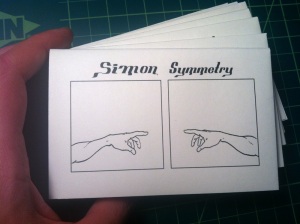
I’m premiering a new Simon mini comic that I co-created with my brother.
 I’ll have a 6 page preview of my upcoming comic Victus,
along with a special treat for anyone who pre-orders issue 1 at the show.
…
Speaking of Victus:
 I’ve been scanning like crazy!
 And what’s this? A preview for issue 2 already!?
…
INSPIRATION
Some images that have inspired me lately…
 I wish I could make books like this.

BARTKIRA! Genius.

I saw Shane Carruth’s Upstream Color. Wow.
 And I’ll end with another Kirby moment of zen.
…
Hope some of you can come down to the show this weekend! Mention the blog and I’ll give you a discount on any purchase!
– Tyrell
I went to Chicago Zinefest 2013
Posted: March 15, 2013 Filed under: Conventions, My Favorite Things, Simon | Tags: Ashley Elander, Beth Hetland, chicago zinefest, Chris Garcia, In This Issue Podcast, Kseniya Yarosh, Marnie Galloway, R. Hendricks, Zinefest 2 CommentsChicago Zinefest ROCKS!
I had tabled at Zinefest in the past, but this year I opted to just attend and enjoy the show. And boy did I! This show was full of some awesome folks! Here’s some of what I saw:

The Great and Powerful Beth Hetland had her Hourly Comics minis available!
…
 The always fantastic R. Hendricks (Stranger Two Stranger) had this awesome mini of portraits.
…
 Ashley Elander was, as usual, putting the rest of us to shame by showcasing her phenomenal drawing skills.
…
 I fell in love with this accordion mini compilation of text book illustrations from Kseniya Yarosh.
…
 I was happy to catch up with the lovely Marnie Galloway, who had the new editions of In the Sounds and Seas.
…
 Next to Marnie, I discovered a talented gentleman named Chris Garcia. He had previews of his upcoming beautiful first comic ever (!)
…
 And the youngest and most enthusiastic exhibitor at the show had to be Henry Comerford! Super awesome one page comics!
…
All in all, Zinefest 2013 was a blast. I can’t wait to see more from all these folks. I really need to table here next year!
…
Here’s a preview of a new Simon comic I’m cooking up…
 …
…
I thought I had posted this before, but I guess not:

…
I did this poster for the fine folks over at In This Issue Podcast. It just so happens I’ll be tabling with these goofballs at TRICON in 3 weeks!
…
Thanks for checking in ya’ll!
– Tyrell
Work
Posted: January 23, 2013 Filed under: Process, Simon, Victus | Tags: comic book art show, comic book techniques, dimensional portal, simon comics, victus, woodcut comics 4 CommentsHey there…
Thought it was time to actually post some images of stuff I’ve been up to:
Here is a quick shot of me installing and another shot of my installation in the Artwork6 Exhibition at the SAIC Sullivan Gallery:


Thanks to Christina for the picture of my installation. There is some fantastic work in the show, so please come by and take a look.
…
Here is a new Simon mini-foldy comic that I’ll be premiering at my next convention:


I’ll have more info about the conventions I’m attending in the next post.
…
And here is the first official poster/image/promo for my next project Victus. It features the character Celeste, but you can call her ‘Cel’. More of these are on the way and will also be available for purchase as prints.

…
Hope you are all well!
Tyrell
Printing & Self-publishing pt. 2
Posted: December 21, 2012 Filed under: My Favorite Things, Process, Simon 1 CommentIn case you missed Part 1, where I discuss print-on-demand services, check it out:
Printing & Self-publishing pt. 1
…
Part 2: Printing ‘at home’
One of the coolest things about printing your own comics now is that photocopiers have gotten about 10 million times better than they were even 8-10 years ago. Even at a local kinkos (or whatever they call them now), you generally are going to find full featured B/W and Color copiers, capable of about any task you can dream up. I often use these big stores, but with this in mind: They will not help you unless you demand it. They could care less what you need or how the machines work. If you want something cleaned or a new toner put in the printer, demand it. They’ll do it.
Of course, this is only part of the process. If you are planning to use commercial photocopy/printing places and do your own assembly & binding, I recommend doing a few things to bring more life to your project:
1. Buy your own paper: A nice paper stock that fits your project will goes miles to improving the overall look/quality of your final product. I LOVE paper. I can spend hours in a papershop looking at, touching, and smelling (yeah I know) paper. It’s not easy to find stores with a lot of paper variety or paper sizes, but they do exist. Just look for ‘office supply outlet stores’ or ‘paper wholesale’ in your fine city. Here in Chicago, I used to go to xpedx before it closed. And of course there is always paper source. Really look at the tooth of the paper, the way it folds, the color. It’s as much a part of the finished piece as the drawings!
2. Buy your own stapler: You can use big staplers at the kinkos type places, but it’s much easier to do this at home at your convenience, especially since you’ll probably do the majority of your collating and folding at home. I prefer the A-frame/booklet style, but many of my self-made comics folks love the long-neck staplers. I’ll also mention that staplers are one of those things that ‘you get what you pay for’. So plan to spend 20-40 bucks on your stapler.
3. Get a bone folder: Dude… bone folders are the coolest things. Mine is almost like a security blanket. I just like carrying it around an holding it. Weird I know (hey, I smell paper). These little guys will save your fingers, speed up the process, and give your books a much cleaner fold.
4. Get a guillotine cutter: Or find access to a mechanical industrial paper cutter. Cutters are kinda expensive, so if you can use one somewhere else, you can avoid buying one. I’m currently able to use both a regular guillotine and and industrial cutter at my place of work (lucky me!). If you are getting one, I recommend something large enough to cut at least 15″ paper.
…
For my Simon comics, each piece/book is usually a different size, number of pages, paper type, binding, etc. I find this to be one of the coolest and most fun things about self publishing. I love that I can make books of the same ‘series’ a large variety of forms. Publishers don’t really do that (unless you’re Chris Ware).
For these books, I generally go down to the fedex/kinkos/ups/local print shop and do all the printing. I bring my own paper. Sometimes you can get them to give you a discount if you ask (since you are providing my own paper). Generally, my stuff is B/W so the cost is not CRAZY. But it’s not cheap either. I always keep track of the price to print each book, as I’ll use that when determining price later.
I do all the collating, binding, folding, (and some) cutting at home. I enjoy this part of the process. It’s very zen. Also, when I sell a Simon book to someone, I know they are getting something special. Something personal. It’s one of the purest forms of communication in art that you can participate in. You are putting a precious object into someone’s hands and (hopefully) that item will become a precious object to them as well.
…
I’ve had the privilege of meeting some rock stars in regards to ‘at-home’ self-publishing. Here are a couple creators you can’t go wrong with:
Kenan Rubenstein

Kenan is blowing my mind with his latest comic Last Train to Old Town. This is a great artist hitting his stride and making something beautiful. Get on board! Lucky for us, Kenan is making printed copies of Last Train, and he puts most of us to shame with the utter quality of his constructions. For a real master class, check out his blog.
…
Marnie Galloway

Marnie’s In the Sounds and Seas just won a Xeric Grant (I think this might be the last xeric). Try to get a hand-made copy if you can, as they show a real care in their construction and accentuate her beautiful artwork. Everything I’ve seen her exhibit is top notch and you can see more of her process on her website.
…
Here is some other stuff I’ve been looking at lately:

I love these ornamental letters
 an amazing ‘cover’ of a Moebius drawing by this gentleman
 and one from Joseph Noel Paton
…
Happy holidays to you all! I hope you have safe and fun times with your loved ones!
– Tyrell
